Portfolio for a unique teacher
Glenn Kachmar is an independent educator with a special talent. He's a living, breathing mad scientist who also happens to be an excellent educator. In creating his portfolio, no cookie-cutter template would drive his unique proposition. For Glenn, creating the foundations of a brand that told his story was essential.
Branding • Website design

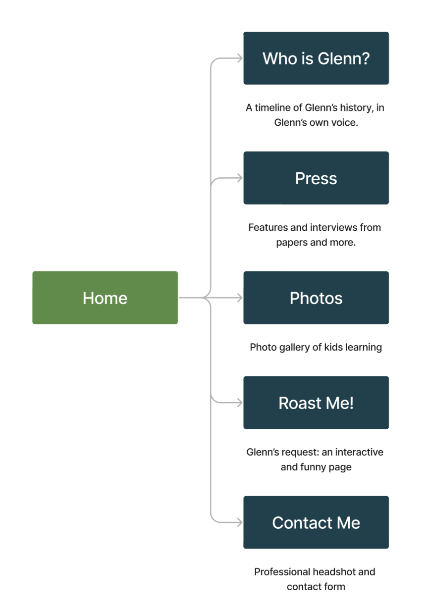
Navigation
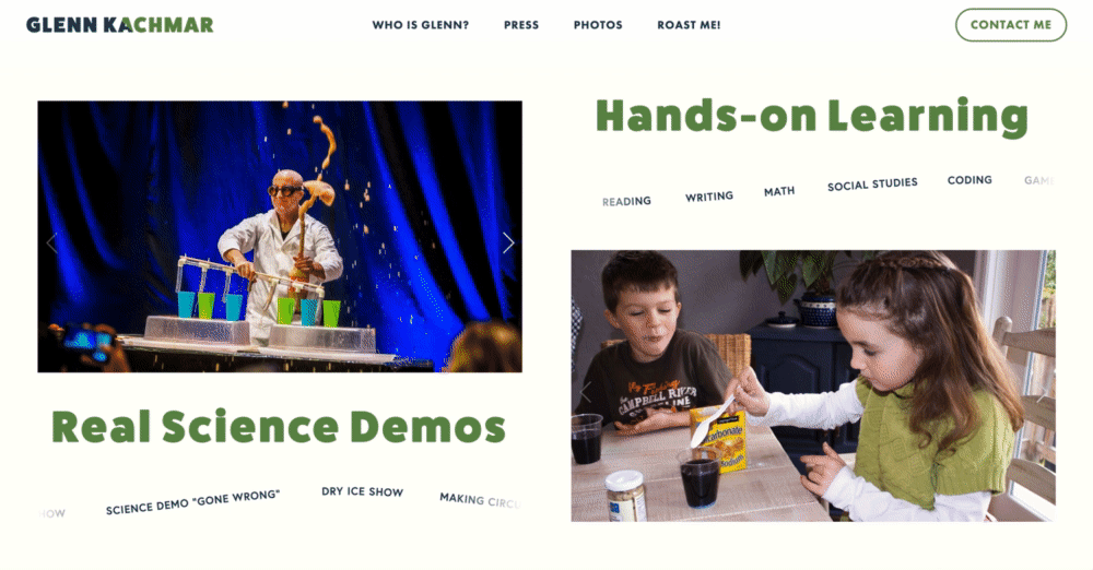
How do we get visitors to understand Glenn's unique value, while ensuring conversion? We considered breaking Glenn's different offerings (tutoring, science demos, teaching at a school) into separate pages, keeping a single-pager website with a contact form at the bottom, or following a e-commerce approach by having his offerings on the front page like products.
A persona analysis revealed that people who visit Glenn's website are most likely: friends, referrals, other educators, and people who have met him. They're coming to the site with a curiosity about Glenn. So, we created a navigation flow that focuses on education and expression. The headings ultimately chosen invite the visitor to interact with and learn about Glenn as a person.
Voice and Tone
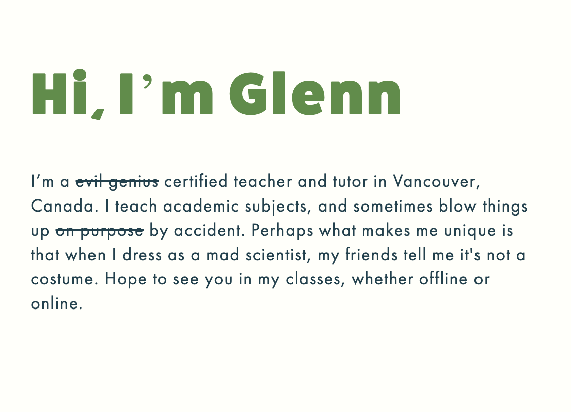
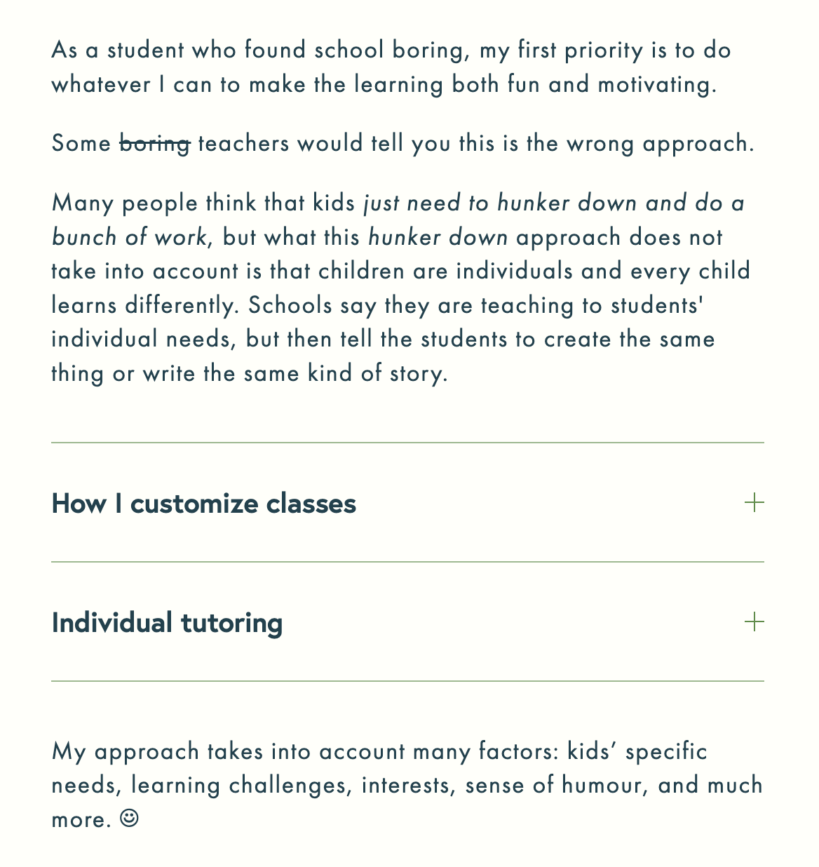
Glenn has a witty, expressive voice. He often slides in dry jokes, puns, and references into his speech. Talking to him is like following a stream of water. You're fascinated by what he has to say but might find yourself wondering where you started. Mostly, you're infected by his bubbling enthusiasm about learning.
Glenn expressed a wish to be represented more professionally, but I knew that parents and kids are attracted to him because of his colourful personality. So, in designing the call-to-actions and creating bits of copy for the site, encouraged fun, creating witty subheadings, utilising strike-outs and even adding happy faces. Where possible, I asked him to write for the site in his natural voice, providing direction, content guidance and editing.
Glenn expressed a wish to be represented more professionally, but I knew that parents and kids are attracted to him because of his colourful personality. So, in designing the call-to-actions and creating bits of copy for the site, encouraged fun, creating witty subheadings, utilising strike-outs and even adding happy faces. Where possible, I asked him to write for the site in his natural voice, providing direction, content guidance and editing.
Active • Conversational • Story-driven • Simple • Witty • Friendly
Styling
I chose balanced sans-serif fonts to avoid traditional school library vibes. Fat Frank as a heading is generous, but also a little fun. Europa and Futura PT as body and link fonts are simple and clean. I increased the font-spacing to evoke comfort, and maintained white space to focus on the interesting copy and unique images.
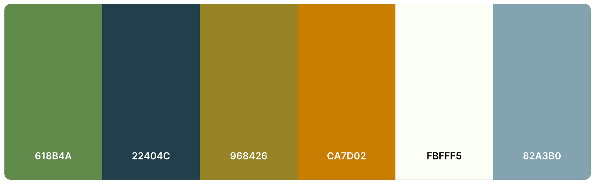
I leaned toward greens and blues as part of the science theme, but realised there was room to be more colourful. So, I created colourful hover animations and introduced marquees within the site to provide vibrancy.
I leaned toward greens and blues as part of the science theme, but realised there was room to be more colourful. So, I created colourful hover animations and introduced marquees within the site to provide vibrancy.
Special Touches
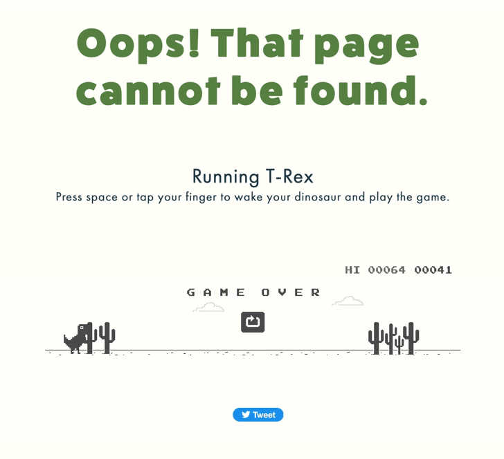
404 page. If you ever get lost on Glenn's website, you can enjoy a little game for your trouble. It's not an original idea, but I think every detail should be considered.
Testimonial
Glenn Kachmar, Independent Educator, 2023
I hired Orchid as a Designer and the (unofficial) lead for a small team creating a new website to promote my work as an independent educator. I added "unofficial" as we had never discussed her taking the lead, but I definitely let her steer the ship and this was the right approach.
Orchid brought a deep knowledge of how people interact with websites and how best to portray my skills and experience in a way that would help promote my work and activities. I suspect that I had quite a few terrible ideas of how we could present my information and she patiently and expertly steered me away from these ideas while presenting better ways to achieve my goals with the website. Orchid brought humour and professionalism to the task and creating a website with her on our team was truly a pleasure. The finished product looks professional, is easy to navigate, and has already started to boost my business. I can recommend her with 100% confidence.